The best colours for a restful bedroom
And which ones to avoid
3 min leestijd
A bedroom isn't a living room. Sounds obvious, but it's often forgotten when choosing colours. In a living room you want energy and warmth; in a bedroom you want calm and rest. Colour plays a bigger role here than you'd think — not because of vague "colour psychology," but because it literally influences how relaxed you fall asleep and how you wake up.
What research says (and what's nonsense)
Studies have suggested bedroom colour affects sleep duration. The most-cited Travelodge study (2013) put blue first, followed by yellow and green. It's not authoritative — and the effects are small. What does hold up: • Dark, muted colours make a bedroom feel darker at night, which supports sleep. • Bright or contrasting colours stimulate visually — exactly what you don't want before sleep. • Personal preference is a big factor — if a bright colour calms you even though research labels it "stimulating," it's calming for you.
There's no objective "best colour" — but there are patterns that work for most people.
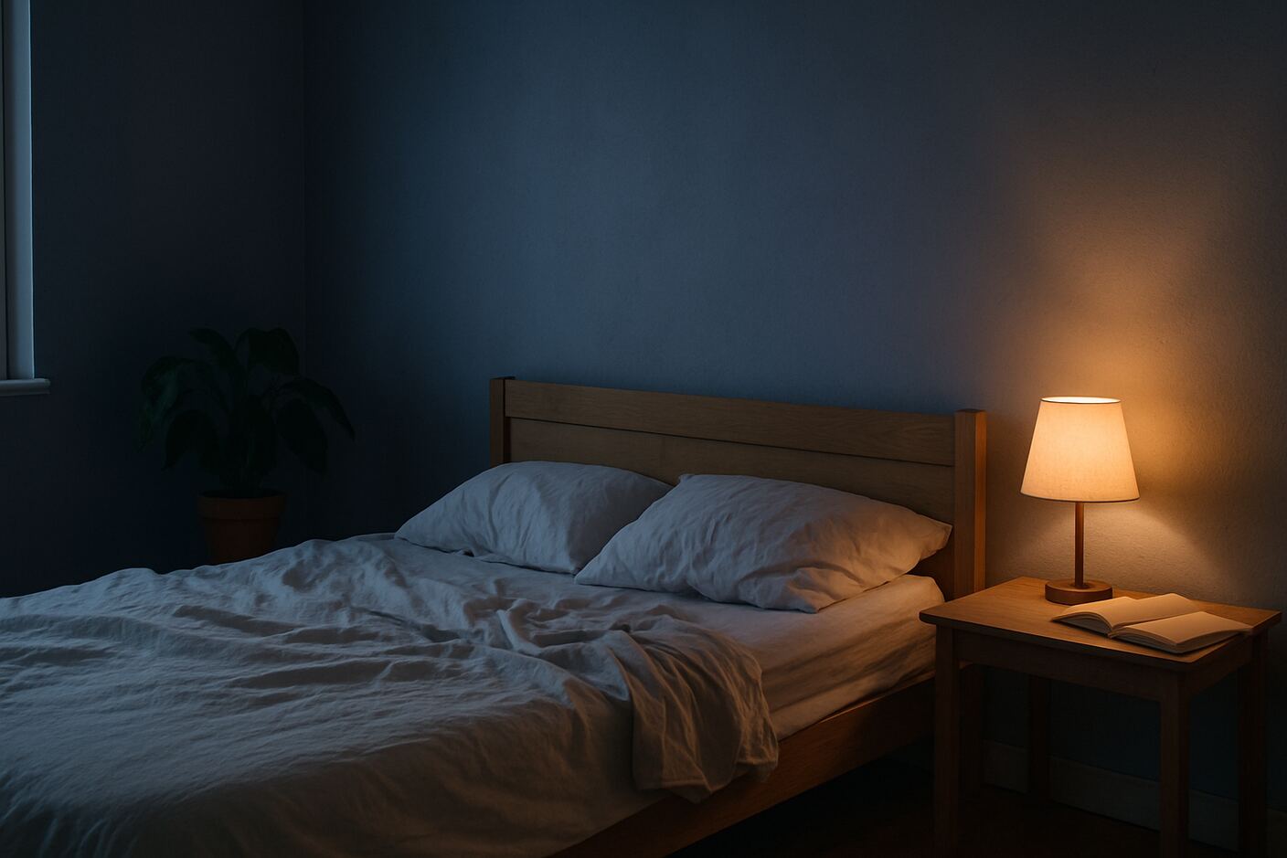
The six best categories
- Soft blues (slate blue, misty blue) The classic. Works almost everywhere. Keep it muted — Tiffany blue is too energetic. 2. Off-whites and soft beige Safest choice. Visually calm, easy to combine. Especially good in bedrooms with little daylight. Pure bright white can feel cold — choose "warm white." 3. Sage green Trendy right now, but also objectively good — natural and calming without being sleepy. Pairs with almost any furniture. 4. Earth tones (terracotta, clay, soft rust) Warm and enveloping. Especially lovely in bedrooms with wood furniture or natural materials. Avoid overly orange tones — go earthier. 5. Mauve / muted purple Underrated, very calming. Especially nice in rooms with plenty of daylight. Surprisingly good with soft green or beige. 6. Dark "moody" colours (dark green, mustard green, ink blue) Done right: ideal. A dark green wall behind the bed creates a cocoon feel. Requires good artificial light and lighter curtains and bedding.
The four colours to avoid
-
Bright yellows — stimulating, harsh, and often look greyish in bedroom light. Pastel yellow can work; sunflower yellow can't. 2. Hard red — stimulating, subjectively raises heart rate. Nobody falls asleep easily in a deep red room. Fine as an accent, not on a whole wall. 3. Pure black walls — works in magazines, but shrinks the room and is hard to light well. Dark grey or ink blue give the same moody feel without the issues.
-
High-gloss white walls — reflect every light source (streetlamps, early morning light through curtain gaps). Bedroom walls should be matte or eggshell.
How to choose for your bedroom
Question 1: How much daylight do you get? • Lots (large south-facing window): almost any colour works, including dark. • Little (small window, north-facing, back room): stick to softer, lighter tones.
Question 2: How big is the room? • Small (<10 m²): light or soft. Pure dark makes it claustrophobic. • Large: dark can work, even recommended — otherwise it feels stark.
Question 3: What furniture do you already have? • Dark wood bed frame: softer light walls work better. • White or light wood: any direction. • Lots of black steel: choose earthy tones or soft green.
Don't forget textiles
Wall colour is only part of the story. Bedding, curtains, and rugs often shape the mood more: • Linen bedding in soft tones (ecru, dusty pink, sage blue): timeless and calming. • Blackout curtains slightly darker than the walls: visually calm and functional. • A rug next to the bed in a natural colour (jute, wool): warms the room and feels good on bare feet.
Visualise before you paint
Paint swatches on the wall help, but you only see small patches. How a full wall looks with your bed, curtains, and wardrobe is hard to imagine. Tools like Veyra let you upload a photo of your bedroom and see how different colour schemes look as a whole — including matching textiles and accessories. That saves a lot of painting you don't have to redo.
Frequently asked
Which colour for a shared bedroom? Pick a neutral base (off-white, soft beige, light grey) and add personality through textiles. Flexible as preferences change. Which colour for kids' rooms? Babies: soft, calm tones (light green, soft blue, soft pink, beige). Older kids: let them have a say, but steer toward calming tones for sleep.
Should every wall be the same colour? Not necessarily. One accent wall (often behind the bed) in a deeper tone, others lighter — works very well. Keep both colours in the same palette.
Zie het eerst. Koop het dan.
Upload een foto van je kamer en Veyra laat je echte meubels zien, geplaatst in je eigen ruimte — binnen een minuut.
Probeer Veyra gratis